


- SEO Services

-
-
Managed SEO Banner
-
Link Building Services
HARO Link Building
Digital PR
Publisher Outreach
Guest Posting
Partnership-led SEO
GMB Management
Local Optimization
-
SEO Auditing
Website Migrations
Page Speed Optimization
Content Strategy
Copywriting
Keyword Research
On-Page SEO Services
Blog Writing Services
-
Google Ads
Facebook Ads
PPC
Amazon Ads
Our Blueprint
SEO Advisory
Brand Defense
Conversion Rate Optimization
-
-
-
- Free consultation
 (929) 377 1035
-
-
- SEO Software
-
-
Bulk DA Checker
SEO Content Optimizer
SEO Content Assistant
Rank Tracking
Keyword Research
Backlink Analysis
-
-
-
Phone Number
Free consultation(929) 377 1035
-
-
- For Agencies
-
-
White Label Link Building
White Label SEO
White Label SEO Software
White Label PPC Services
-
-
-
Phone Number
Free consultation(929) 377 1035
-
-
- Industry Solutions
-
-
SEO for B2B Companies
SEO for Ecommerce Brands
SEO for SaaS Companies
SEO for Healthcare Companies
SEO for Government
SEO for Enterprise Companies
-
National SEO
International SEO
Small Business SEO
Local SEO
Big Commerce SEO
Shopify SEO
-
-
-
Phone Number
Free consultation(929) 377 1035
-
-
Mobile SEO – The Complete Guide 2022
–Updated for 2022– As of 2020 over 58% of site visits now come from mobile search traffic. If you aren’t taking mobile into account heavily enough, it’s […]
–Updated for 2022–
As of 2020 over 58% of site visits now come from mobile search traffic. If you aren’t taking mobile into account heavily enough, it’s likely hurting your business.
The use of mobile devices is rapidly changing the way customers are searching, engaging, and buying. Consumers have access to faster Internet while they’re on-the-go. That means Internet traffic is increasing through mobile devices. Beyond social engagement and consuming content, they’re also making buying decisions.
Mobile Search is Often the First Step for Purchases
According to Morgan Stanley, 91% of adults keep their smartphones within arm’s reach. That’s ninety-one percent of ALL adults, and it’s shifting both business culture and research practices. Rather than dedicating time to research a topic, users now perform micro-searches on the go, and then follow-up on those initially discovered options or solutions later on.
How big is this trend? An IDG Global Solutions survey found 92% of senior execs own a smartphone used for business, 77% of those research business purchases from their mobile device with 95% then finalizing related purchases via laptop/desktop. That’s a huge portion of the B2B purchase pool starting their journey from mobile. Missing a user during their initial mobile-based exploration may mean your business is losing out on a huge portion of the market.
Mobile Search is Often Location-Oriented
This trend is even more compounded for local businesses, as 58% of mobile users search for local businesses daily. What’s more? 89% of those users search for a local business at least once per month. We also learn from HubSpot that, when consumers do a local search, 72% of them visit a store within five miles. What does this mean for business with an Internet presence? It’s time to make it mobile-friendly.
What Does the Rise of Mobile Search Mean for Businesses?
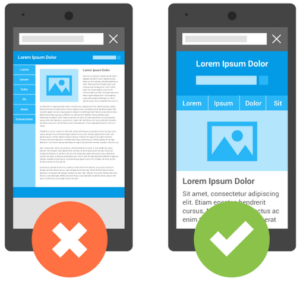
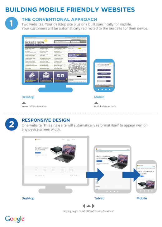
Websites now need to be responsively designed so they can serve mobile users just as well as desktop users. Responsive design is a design that adapts to the size of the users viewport (i.e. screen), by changing font sizes, adjusting images, and even collapsing page elements to make navigation simpler. Responsive websites that follow modern design standards help users access and understand the information they need more quickly.

Because mobile users comprise an increasing number of searches and site visits, they now represent the largest source of traffic in a slew of markets (new industry segments falling into this bucket each month). Our clients regularly pick up market share with simple mobile-friendly design updates, especially within industries that are traditionally late-adopters.
Your Website is Now Your Storefront
Your site is now your storefront. If your site looks terrible or functions poorly, users will leave instead of working to get at your information – it costs a user nothing to click the next result in search.
Google Prioritizes Mobile-Optimized Sites
Google has switched over to mobile first indexing. Mobile-first indexing prioritizes mobile friendly sites over other sites in the organic search results. Even if your target consumers aren’t heavy mobile-users yet, your site still needs to be mobile-optimized if you want to show up higher in the search results (even for desktop-based searches).
Users Are Making Purchase Decisions from Search Alone
With mobile devices rapidly changing the way consumers access information your offsite optimizations are also becoming critical. For example most users performing local searches never go past the search results themselves (aka they don’t actually click into websites anymore). Local search users are typically able to surface the information they want directly within the search results through features like the local Map Pack.
How Can I Improve My Mobile SEO?
The first step toward reaching mobile users is having a mobile-friendly website. Currently, in 2021, responsive web design is the best design approach for mobile-friendliness. Responsive design is the best approach for mobile design because:
- You will serve the same content to both mobile and desktop users
- The content will adapt responsively to all screen sizes and mobile device types
- Search equity is centralized to a single URL for all pages
- It’s a better user experience
- Google prefers responsive design
What exactly is responsive design?
Responsive design in an approach for creating web pages where layouts and content dynamically adapt to the size and orientation of the screen or viewport being used.
In the example below you can see that the desktop version of this responsive site the text and video are displayed side-by side, and in the mobile version of the site those elements have been stacked.
 |
 |
This responsive theme adjusts to the width of different devices from smartphones to tablets, even large wide-screen viewports, by rearranging and resizing the design elements.
There have been a few ways to handle mobile sites since the invention of smartphones, the first two mobile design waves were plagued with usability issues, and hard to maintain. Let’s take a look at what didn’t work, and why you should consider migrating to a responsive design if you’re still employing one of these outdated mobile design tactics.
Outdated Approach #1: Mobile Subdomain, Separate Mobile Website
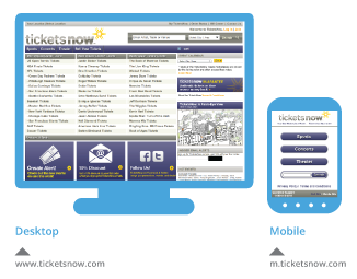
This approach required setting up canonical tags for every page, as each mobile web page contained content duplicative to the desktop page. This approach also split the search equity for each page as desktop users interacted with the desktop site, and mobile users interacted with the mobile website.
When users shared pages from the site, creating backlinks they were split between the mobile subdomain and the regular site domain as separate URLs were being served to each user group. It also meant that every time an edit was made to content on the desktop site, a second round of edits had to be made on the separate mobile site. Mobile pages under this paradigm often provided a worse user experience as they typically served less content than the full desktop site did for desktop users.
Outdated Approach #2: Dynamic Serving of Mobile Sites
The next wave of design consolidated pages under a single URL, but dynamically served cached pages based on the user’s device type using a vary http response header.
This iteration of mobile design allowed sites to consolidate search equity between their desktop site and mobile site. It also did away with the need for canonical tags on virtually every site page.
However, it meant that every time a device came out with new dimensions, a new instance of the site had to be spun up, formatted, and tested to be served to users. This system became increasingly impossible to maintain as the market diversified and the dimensions for mobile screens became rapidly non-standard. Dynamically serving a mobile version of your site was plagued with issues including a repeated issues with serving the desktop version to mobile users.
Current Best Practice: Responsive Design
Responsive design consolidates the mobile version of a webpage and the desktop version of a webpage under a single URL. It also serves the same instance of code, regardless of the size of the mobile screen or desktop viewport.
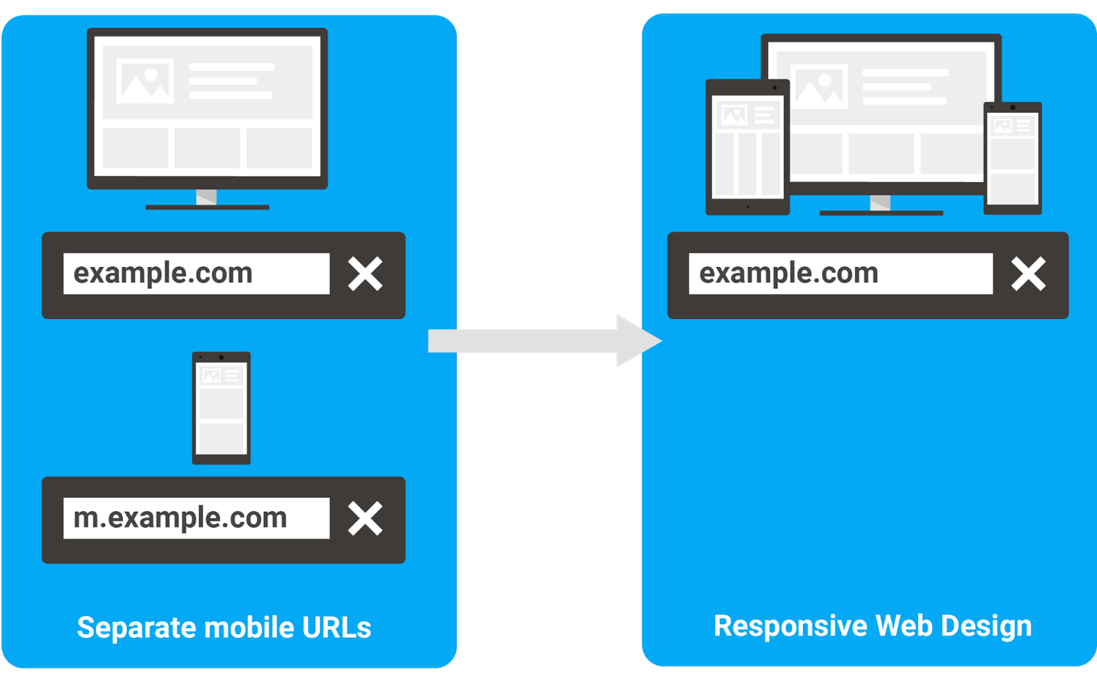
Instead all elements fluidly rearrange to suite mobile visitors and desktop visitors as needed. If a user switches from full screen to half-screen with their browser, the design elements will shift accordingly so the user experience is largely unchanged.
How to Check If Your Mobile Site is Google-Friendly
In July 2019, there were over 1.69 billion more mobile searches than desktop searches performed in the US alone (source, source). Search itself has become mobile-first. The first place you’ll start when checking your site for mobile optimization is checking out how Google views your site.
Mobile SEO Strategy is All About Google
Google holds over 90% of the market share for mobile search traffic in the U.S., because Google has spent years optimizing search specifically for mobile users. Many of Google’s search results are so well optimized, that mobile users don’t even need to click into an actual result to find the information they need.
Rich snippets and rich results now display enough information for users to take action based off of the search results alone, from finding movie times to the addresses of local businesses, to how to troubleshoot tech problems.
How did Google get so far ahead of the competition with mobile search? They started testing and prioritizing mobile features years ago, and as mobile search volume overcame desktop search volume, Google shifted to prioritizing mobile users over desktop users.
A Brief History of Google’s Mobile Search Results
In 2015 Google rolled out mobile-friendly search results, serving a separate set of search results to mobile devices. This update, often called Mobilegeddon, prioritized mobile-friendly websites in the search results.
 |
In 2016 Google began to experiment with mobile-first indexing, cataloguing the mobile version of page content, rather than the desktop version.
In March of 2018 Google formally began rolling out mobile-first indexing, and migrating over to the mobile-version of pages for sites that it had already indexed as desktop versions. To quote Google themselves, “Mobile-first indexing means that we’ll use the mobile version of the page for indexing and ranking, to better help our – primarily mobile – users find what they’re looking for.” Essentially the entire index is going mobile-first. This process of migrating over to indexing the mobile version of websites is still underway. Website’s are being notified in Search Console when they’ve been migrated under Google’s mobile-first index.
In July of 2018 Google rolled out page speed as a mobile ranking factor, ranking sites with slow load times lower in the search results.
Figuring Out Which Trends Will Last
Over the past decade Google has also continually rolled out additional data-rich mobile-first search features from movie times, to reviews, to product images. Google often pivots when rolling out new features, as it continually tests and then prioritizes what works best for serving users the most valuable information.
For example, Google originally published a guide helping webmasters create separate mobile sites under the m.domain.com URL – a tacit approval of the process, only to pivot within a year to formally recommending responsive design under a single unified URL.
Sites using AMP pages are often managing two sets of page content, with one set slimmed down to meet the AMP standard. There are also challenges with AMP pages being served from a Google URL rather than the site’s own domain. While Google recently addressed some of these concerns with signed exchanges, but it’s still causing questions around whether link equity is being split between the AMP viewer URL, the original AMP source, and the AMP cache URL.
Trends that are here to stay? Responsive design, quality content that gets right to the point, making sites as fast as humanly possible.
Check if Google is Flagging Mobile Issues
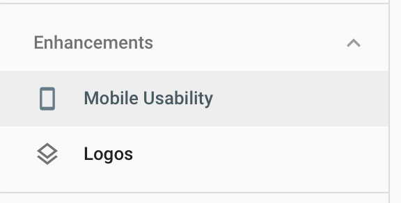
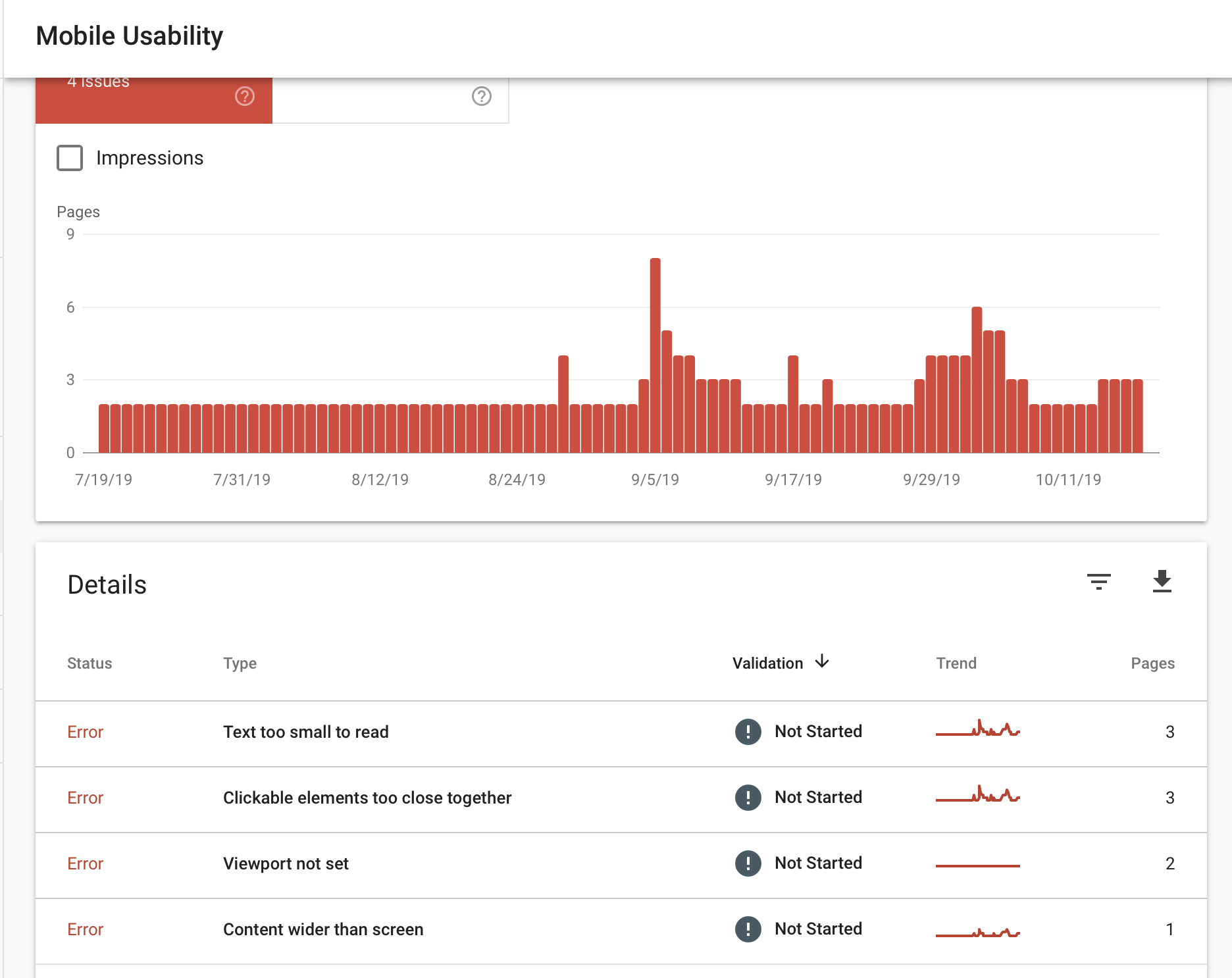
So what should you pay the most attention to in terms of Mobile optimization? If you already have a website, start with Google’s Mobile Friendly Test. This tool will give you an aggregate rating for whether or not Google thinks your site is mobile-friendly. The tool will also prompt you to view a full usability report in Google Search Console.
If you want to access this report on your own directly from Search Console, login to your account for the domain, and use the left-hand navigation to click into “mobile usability” under Enhancements.
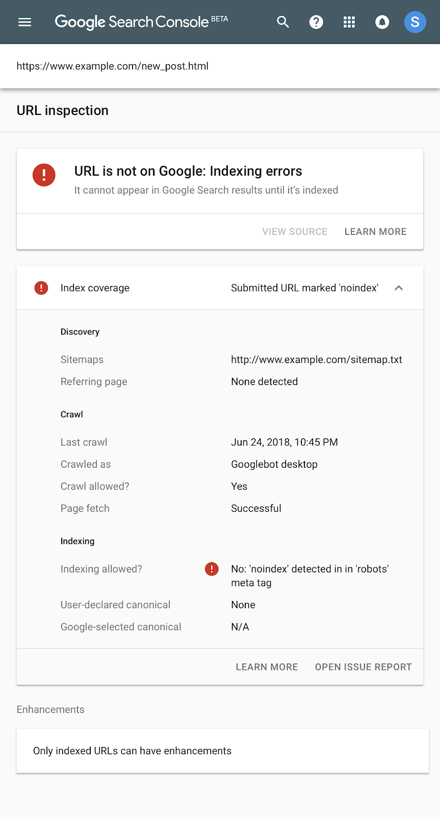
Check if Google Is Indexing Your Webpages
Google can’t serve pages in the search results that it can’t see. Make sure that Google is indexing your pages for search.
Enable Crawl by Googlebot

To check if your robots.txt file is blocking Googlebot, you can either use a free robots.txt tester, or use the link inspection feature in search console.
NoIndex
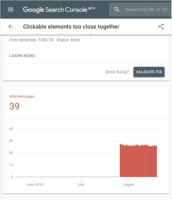
A few years ago you could check blocked resources straight from google console in a consolidated view, but as these issues became less prevalent google has dropped the aggregate view. Secondary tools like screaming frog can still give you a full list of NOINDEX and NOFOLLOW pages from your site. Alternatively you can check the status of individual links straight from Search console using the URL inspection tool.
Checking if Your Mobile Site is User-Friendly
Now that you’ve resolved a majority of the technical usability issues, it’s a good idea to check for issues mobile users face that may not have caught by Google.
How Does Your Site Appear on Mobile?
Start by taking a look at how your site appears on different devices, this free tool will let you select from a variety of mobile devices and desktops to give you a full sense of how your site looks on different devices.
You should quickly be able to see any major issues with formatting that could be hindering the mobile user experience, or making your site look unprofessional. Examples include poorly formatted text, grainy or stretched images, or overlapping page elements.
Work with your webmaster or web development team to clean up any design elements that aren’t displaying well on mobile. Once your site layout is mobile optimized, you’ll want to check that your site is compelling to mobile searchers on the Google search results page.
Are the Visible Portions of Page Titles and Metas Compelling?
Users only click into a site from search if the rich snippet, page title, and/or meta description are compelling. Your title tag for your page needs to front-load your target keyword(s), and your meta description should include the most pertinent information about your page first.
Page titles can be very similar between pages, so meta descriptions can often make the difference for which result or results site visitors click.


If you’re seeing a good amount of organic traffic from your target keywords, the next step is to make sure that traffic is actually seeing your mobile optimized content.
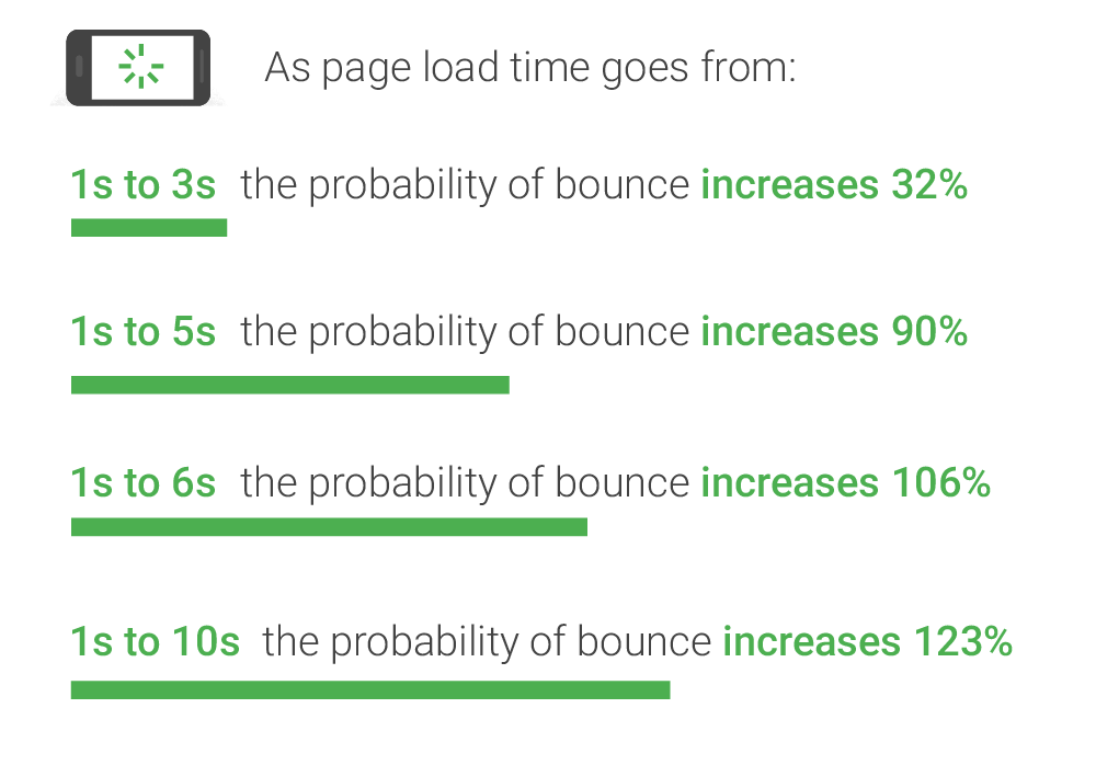
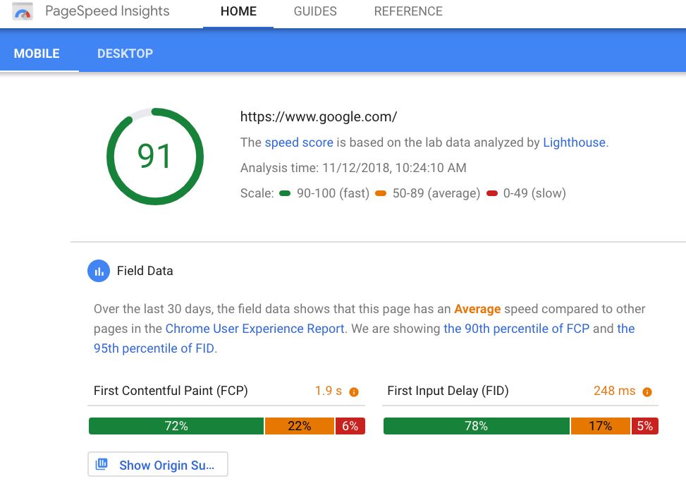
Are You Losing Visitors to Page Speed?
Over half of mobile searchers will abandon a page that takes longer than three seconds to load. Separately, for every additional second it takes a page to load, conversions fall by 12% (Google, 2018).
To check your mobile page speed use Google’s PageSpeed Insights Tool, and see how quickly your site loads on a 4G connection. This tool will give you a granular breakdown of all speed issues you can address to improve your site speed.
Do Any Pages Have Super High Mobile Bounce Rates?
Bounce rates are a great indicator that a page is not providing value to users. If you see bounce rates are much higher on specific pages for mobile users than for desktop users this is a sign that the page may have some issues with either mobile formatting, mobile load times, or that the relevant content may take too long to scroll to on mobile.
To check bounce rates, simply login to your Google Analytics dashboard. You’ll be able to view aggregate bounce rates for your site, bounce rates by page, and track how bounce rates change as you make adjustments to webpage content.
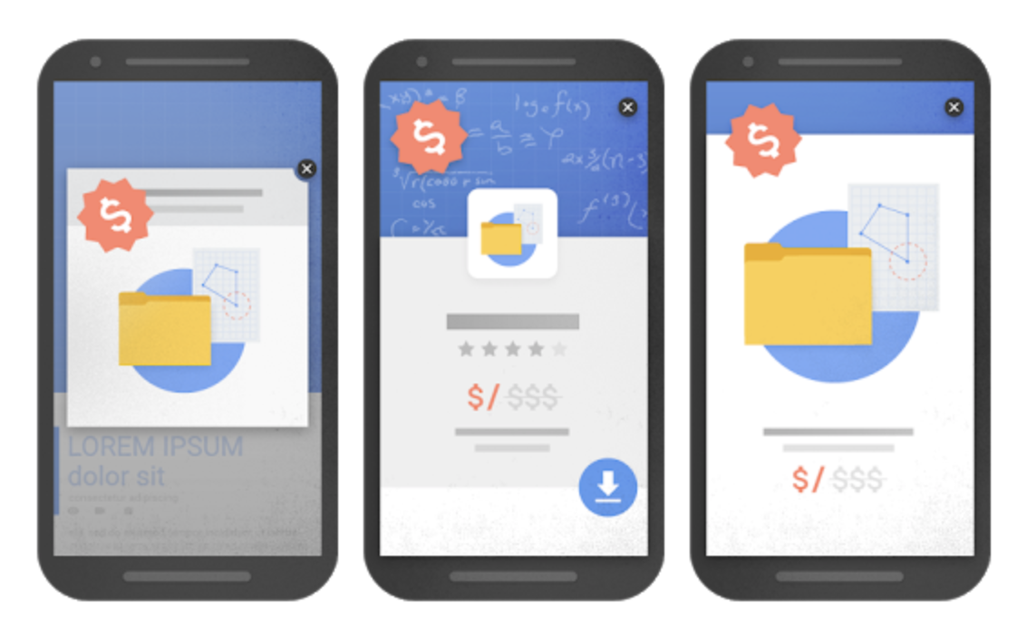
Avoid Intrusive Popups
Intrusive pop ups, and poorly designed pop ups can increase your bounce rates on mobile and tablet devices. Intrusive popups can also hurt your organic search rankings, especially with Google. An update Google rolled out in 2016 devalues mobile pages that have intrusive pop ups, lowering the page’s rankings in the search results.
There are two major popup issues that can cause bounce rates and devaluing of a page in SERP. Pop ups that have not been optimized for mobile traffic can be impossible to close on small screens, and may cause mobile searchers to bounce from your site. Pop ups that prevent a user from accessing content on-load will hurt your mobile SEO especially with Google. Google considers pop ups that block site visitors from content to be “intrusive.”
Examples of intrusive pop-ups and interstitials:
- A pop up that displays immediately, or while the user is trying to read through content
- An interstitial that has to be exited before the user can access the main content
- A full-screen interstitial that has to be scrolled past to access the main content
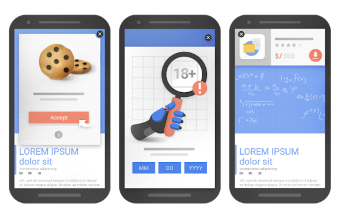
That doesn’t mean you should abandon popups entirely. Used correctly, and designed with mobile UX in mind, pop ups can help improve your conversion rate. These pop ups are ones that help the mobile user along their journey, are contextually relevant to the content, or are a legal requirement. Pop ups that appear as a user is looking to complete the next step in their journey are generally fine as well.
Examples of pop-ups and interstitials that are okay:
- Pop ups that notify mobile searchers that a site uses cookies.
- Pop ups that confirm a user’s age for restricted content or services.
- Pop ups that take up a reasonable amount of room and are easy to dismiss.
Optimize Your Site for Voice Search
A report issued by PwC states that, compared to conducting a traditional search, 71 percent of respondents prefer voice searching. Now that we know users prefer voice search, let’s look at how we can optimize our websites to reach them.
1. BE CONCISE. The average voice response ANSWER is less than 30 words long. Avoid filler or unnecessary terms like “however” or “thus” and be as direct and straight to the point as possible while completely answering a question. Google actually has an entire guide outlining the type of responses selected for voice searches, and the biggest takeaway is that answers should be brief and direct.
2. Voice searches pull in part from “featured snippets.” That means, when someone asks a question using a voice search, Google pulls answers from approximately 30 percent of these snippets.
3. Consider the user’s intent. When crafting your content, ask yourself what users are searching for before landing on your site. Doing this will help enhance the content’s relevance. Therefore, if you’re optimizing your page for a specific featured snippet, your goal should be understanding your visitor’s intent and providing them with an answer immediately.
4. Use long tail keywords and questions in headers. Often, voice searches occur as though the user is speaking to a human. Short, choppy keywords are rarely in use. Long-tail keywords and phrases are how people talk. So, when optimizing your site, consider using these phrases in conjunction with questions. That way, your website will pop up more often when users are trying to solve a problem, find a product, or use a service.
5. Optimize for local searches. Users are going to search using local SEO. According to Small Business Trends, 58 percent of mobile users find local businesses using voice searches. Adding phrases to your content like, “near me” or your geographic area will help boost your rankings.
Are You Addressing the Customer’s Journey?
Mobile-friendly websites must think through the customer’s journey. Ask yourself these three questions:
- What types of users hit my site?(Who are they, how old are they, what are their roles)
- What would those users be want from my site?(ex: to establish pricing, to find my business location, to complete an online purchase, to share a story)
- Can each user easily complete their journey using only the main nav?
Your main navigation should help users quickly and easily get what they want from your site, without a user needing to use site search or “click around.” Once you have a handle on your audience segmentation and goals, you should confirm that your users are not facing any major barriers along each journey.
There are a few ways to do that, here are two:
- If you have a program like Hotjar or Lucky Orange installed that allows you to view your own users’ onsite journeys – you can watch user recordings to see if users are struggling to complete tasks.
- Ex: Users abandon scrolling because information is too far down a page
- Ex: Users have a lot of “U-Turns” – pressing back almost immediately because what they wanted wasn’t on the page they clicked into.
- Ex: Users rage-click an element that’s not opening or functioning correctly.
- Ex: You see error messages displayed to the user from your site.
- Ex: You see users begin conversion, but abandon forms or carts.
- You can conduct direct user research:
- Recruit users that you’re able to interact with directly
- Request they complete specific tasks on the site
- Have them explain their thinking and reactions as they interact with your site
Your marketing shouldn’t be only about what devices your potential customer is using, it should be about the journey they’re taking. What are their lifestyles, habits, and device preferences? Conduct research, surveys, and interviews with your current audience. This marketing tactic is an excellent opportunity to develop a relationship with your existing customer base. Offer incentives and prizes to those who choose to participate.
Create Journey-Driven Designs
Designing websites focusing on mobile users means we have drastically less real estate, so minimalism is critical. The last a user wants to do is scroll through or resize your pages. According to a scrolling and attention study the
Nielsen Norman Group conducted, 74 percent of users indicated their viewing time is spent on the first two screens of content. Therefore, responsive design is the solution. You can accomplish this in a variety of ways, including:
- Hiding content under sliders
- Using sticky live chat or feedback widgets
- Implementing mobile pop-ups
- Redirecting to social media
- Creating a bare-bones presentation
- Eliminating sidebars
- Taking advantage of banner space
- Replacing graphics with a search bar
Pro-Tip: For mobile-users, one often overlooked difference is that tap-areas need to be large enough for users to click on interactive elements (links, buttons, drop-downs) with precision.
Mobile User Experience Optimization Recap
For local business:
- Make sure to include NAP (name, address or service area, phone number) on your website.
- Claim and complete your Google My Business (GMB) listing and your Bing Places account.
- Optimize pages to include names of local cities and landmarks
- Focus on location-based rich snippets like the Map Pack
For all businesses:
- Make use of structured data to leverage google search’s rich snippet features.
- Confirm your responsive design is acting as-expected.
- You can use a tool like this Responsive Design Checker to confirm how your site looks at the most common breakpoints
- You can check out alerts and mobile feedback directly from Google through your site’s Google Search Console
- Install a user-session recording software
- Hotjar, for example, will let you see if your users are struggling in any areas (ex: pages are too long and users abandon before hitting content critical to conversion).
- Focus on SPEED:
-
- Optimize images for mobile (reduce file size)
Pro-tip start out with a responsive design or theme and it should handle this for you.
-
- Minify CSS
- Leverage caching
- Enable Accelerated Mobile Pages (AMP)
- Switch anything you have on flash over to HTML5 instead
Final Thoughts
Mobile searching remains the leader because everyone loves the convenience of using their devices. Your audience is busy, on-the-go, and living in a digitally-driven world. As a result, their mobile queries will continue to be on an upward rise. Even though mobile searches are similar to those on a desktop, your site must be optimized for your audience’s visits. Your brand should be easy to use and support your customer’s journey. A mobile-friendly design that responds to the level of mobile searches you receive should be your goals.


Want access to the leading SEO software suite on the market?
See why the world's best companies choose LinkGraph to drive leads, traffic and revenue.
“They are dedicated to our success and are a thoughtful sounding board when we run ideas by them - sometimes on ideas and projects that are tangential to our main SEO project with them. Also, I love that they allow for shorter-term contracts compared to the usual 1-year contract with other SEO companies. Lastly, they deliver on their promises.”


Enter your website URL and we’ll give you a personalized step-by-step action plan showing what exactly you need to do to get more traffic.
- Better tools
- Bigger data
- Smarter SEO Insights
Real-time SEO Auditing & Issue Detection
Get detailed recommendations for on-page, off-site, and technical optimizations.